The AI Conversion
Have you converted to AI yet? I’m writing this in the mid-2025 and I have now fully converted to leverage AI for anything I can process with AI except a few things that are intentionally left out. What do we
Have you converted to AI yet? I’m writing this in the mid-2025 and I have now fully converted to leverage AI for anything I can process with AI except a few things that are intentionally left out. What do we
The dream of creating an application, sharing its source code, and letting a community contribute – all without breaking the bank – is more accessible than ever. Thanks to the generosity of cloud providers and a robust open-source ecosystem, you
Canada’s digital transformation market is experiencing robust growth, projected to reach USD 74.02 billion in 2025 and continue its impressive expansion. Yet, amidst this surge, a concerning “imagination gap” persists, particularly within Canadian small and medium-sized enterprises (SMEs) when it
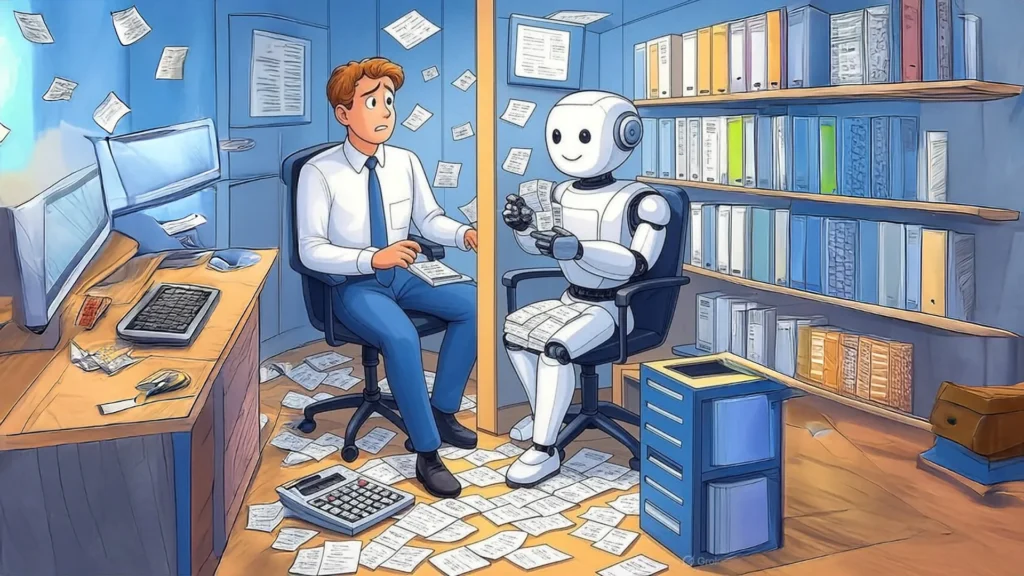
Recall when excel came about? Maybe not if you’re born post 80s. But there was a time when numbers needed to be manually crunched and that’s not too long ago, but seems like it never existed. Yet, AI comes and